Graphic Design Tips For Instructional Designers
Instructional Designers are jacks of all trades. You have to know everything from how to write effective learning objectives and assessments to how to design and develop attractive and engaging learning experiences. Oftentimes, the former comes more naturally than the latter.
In this article, we’ll give you tips to overcome some of the design and development hurdles so that anyone can design user-friendly, aesthetically pleasing, accessible learning experiences.
Top 5 Graphic Design Strategies
Branding
First, you’ll want to start with branding. If your organization or institution has a brand guide, be sure to follow any standards in this guide. Sometimes brand guides are as simple as standard colors to use, while others may include specific fonts and even graphics.
Regardless, you should follow these guidelines and forgo anything that doesn’t match the branding.
Color Theory
If you don’t have a brand guide to follow, some knowledge of color theory is helpful.
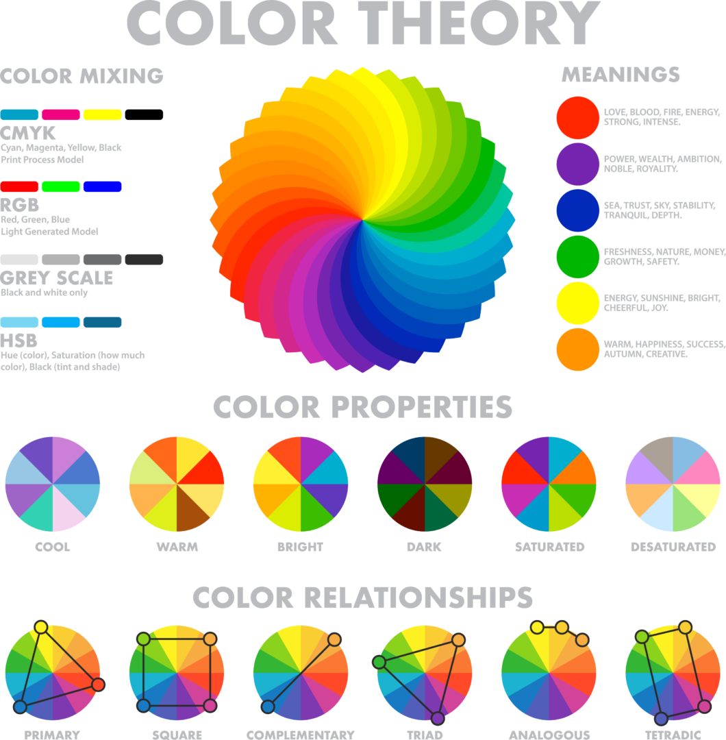
Color theory is more than picking two colors that look nice together and knowing that red and green remind people of Christmas. Color theory intersects science and art; in other words, not only the knowledge and application of color but also the emotional connection colors can evoke.
In fact, color is based on one’s perception, which can be different from person to person. That’s why, in a famous image on social media in 2020, some people saw a black and blue dress and others saw a gold and white dress. There have been other similar phenomena gone viral. Color perception is based on the light reflected from an object and how our brains receive those combinations of lights.

Some colors seem to be universal, though. Warm colors like yellow, orange, and red are energizing, while cool colors like purple, blue, and green are calming.
So how do you pick a combination? Think way back to your grade school days learning the color wheel.
Two colors that are opposite of each other on the wheel, like red and green, purple and yellow, and blue and orange, are complementary colors and can make your logos and text really eye-catching. Three colors that are side by side are analogous colors; these colors can indicate progression or action in a specific direction. Finally, triadic colors are three colors that are equally spaced around the wheel. Used together, triadic colors are contrasting yet harmonizing.
Once you select your colors, you should also consider that some people experience color blindness, resulting in distorted perceptions of colors or the inability to perceive them at all. Learners with visual impairments benefit from highly contrasting colors. A really handy tool to have in your kit is the Color Contrast Checker, which allows you to enter two colors and then it gives a rating. Poor contrast will be difficult to read and should be avoided when using text. Good contrast will result in a better overall experience for the learner.
Typography
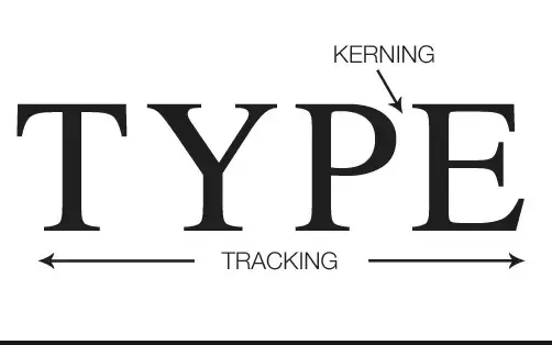
Typography is the art or procedure of arranging type (letters and characters) or processing data and printing from it. This can include the font size, line length (tracking), and letter spacing (kerning) on a single line of text or throughout a document.

Typography plays an important role in how a message is conveyed and received. Let’s look at some examples:

You can see that just one word arranged differently can have a big impact on how you perceive the message. Am I shocked or really excited? You really don’t know, but you get a feeling of how excited I am just through the imagery of these few characters.
Some details are even more subtle. Can you tell the difference between these two fonts?
They both include the same letters, words, spaces, and characters. However, you might see that the second line is easier to read than the first line. Do you know why? It’s the difference between Serif and Sans Serif fonts. Serif fonts have small strokes or lines attached to the end of larger strokes, while Sans (French for “without”) Serif fonts do not have these extra flares, making them easier to read for the average reader and also for the visually impaired and those who rely on screen readers. Using sans serif fonts makes your text more accessible for everyone! If you’re looking for some free fonts to add to your collection, try GraphicPear.
It’s not only the look of type that is important. Alignment can also have an effect on the overall message. In typography, rivers occur when spacing is not equal. Single words at the end of a paragraph are called orphans; single words or lines at the top of a paragraph are called widows. Take these sentences as examples:

Rivers, orphans, and widows should be avoided in typography for a few reasons. First, uneven spacing of words and phrases can be visually distracting to the audience. Second, when words or phrases are removed from the context of the sentence or paragraph, the meaning may be affected. This may be especially pronounced if your learner is using a screen reader for accessibility. Screen readers perceive commas, periods, and even line breaks and paragraph breaks differently, and their interpretation may change the meaning for these learners. Finally, evenly spaced words and phrases are more pleasing aesthetically.
To avoid these typography issues, read your work carefully, delete any double spaces, and adjust line spacing. If you’re having trouble finding these typography faux pas, print your work and review it upside down. This will trick your brain into focusing on the form rather than the words. You can also hire a reviewer. Some post-secondary institutions offer affordable solutions, and there are many freelancers and companies who offer this service.
Images, Icons, And GIFs
Text without supporting images can reduce audience engagement. Fortunately, there are plenty of free images and icons available on the internet. You can even create your own GIFs!
Here are a few places to look if you need some free stock images:
The Let’s Enhance Ai editor helps with image resolution. DesignStripe.com allows you to create your own GIF by adding your own SVG or using a sample from their library. And if you’re simply looking for an icon, Unblast.com is the place to go.

When it comes to using images, icons, and GIFs, though, remember that images of any kind should have a clear purpose in the document and aid the learner with a visual representation of the written or spoken content.
Take these two images as an example. You’ve been tasked with creating an eLearning course teaching new baristas how to correctly make coffee. Sure, the coffee bean background is a nice aesthetic, but it doesn’t add any value to the training. The image on the right of the barista filling the espresso cup demonstrates the process visually. When paired with on-screen text and/or voice-over, you can tell the full story for your learners.
Layout Design
Once you have images, fonts, and colors picked out, you can start to assemble the actual design. This is kind of like putting pieces of a puzzle together—all of the pieces have a place and each piece contributes to the overall picture. Layout design refers to the visual arrangement of design elements as learners will see it.
Proper layout design conveys a particular message to the audience using text and images arranged in a logical, user-friendly way. An easy-to-read design will be both useful and aesthetically pleasing. When done correctly, your learners may not have to read every word on the screen to get the message—images, colors, lines, shapes, balance, and white space enhance engagement and interest and increase the likelihood that your learners will remember what they learned.
There are a few keywords when it comes to layout design that might be helpful:
- Alignment (or lack thereof) can be in the center or on the edge and can refer to images or text being in line. You can create visual interest and draw attention to a portion of the design by misaligning it.
- Proximity means group like design elements together. This not only holds visual interest, but it also reduces cognitive load by allowing the learner’s brain to process these elements at the same time.
- The Rule of Thirds suggests that dividing your design into nine equal quadrants with two equally spaced vertical lines and two equally spaced horizontal lines and then placing points of interest where the lines intersect (also called power points) creates interest.
You might be thinking to yourself, “This all sounds great, but I’m feeling restricted working in a document.” This is an obstacle that many Instructional Designers have a hard time overcoming. We are used to working in documents to create text, but these documents often aren’t sufficient to add graphics and aesthetically pleasing effects. Have no fear! There are wonderful design sites that can take training of any kind to the next level.
Figma.com is an online design platform. After you create a free account, you can start with either Design with Figma (design, prototype, and developer handoff) or Whiteboard in FigJam (brainstorm and diagram together).
Canva.com is a little more user-friendly, especially for the beginner, and is also free. There is, however, a Canva Pro that gives you greater access to templates, fonts, and features. You can create docs, whiteboards, presentations, social media, videos, print projects, websites, and more. There are tons of free templates (that help you with design elements like The Rule of Thirds) available that you can completely customize, or you can create your own. Then you can download your creation and share it wherever you need to.
Using these layout design strategies will help your learners stay engaged in the content and remember it afterwards.
You Can Design!
With just a little bit of knowledge, you can design beautiful, effective content for your learners, whoever they may be!